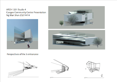
The main focus of my gallery is simplicity. I want this art gallery to be a place where visitors can enjoy and think abut the art work, discuss/ share with their friends, apart from just a space selling art work.

The reason I chose this site in Newtown is because it is located near the most crowded spot in Newtown. It is near bus stop and near railway station, so more people can be noticed of this art gallery.


The facade of the building is of minimalism and modern design (great use of glasses and timber), this can suit the clients' art work, which are contemporary art.
For the interior, I designed a thick wall which cut through all the 3 levels. It is because I want to show that all the art work in the gallery also have some kind of relationship. And that can also separate the staircase and the rooms of gallery. This allow visitors to have a break and deep thoughts about the art work before proceeding to the next level.
The circulation of my building is simple, they mainly follow 1 direction. And without confusing and complex interior design. People's attention will put more on the art work. Moreover, this can make use of the largest space of the site.
Art work of my client are usually display in a large series. As they occupied a large space, so a clear and direct circulation will be suitable. Large pieces of walls are of their greatest use to display artwork, giving visitors enough space and provide different angles for them to enjoy.
There is a cafe seats on the ground floor near the entrance. I made the cafe here apart from giving people a place to chill out and relax. It also reflect one special feature of Newtown. As it is famous with its nice cafes.
There are two entrances, getting into the gallery, you will have a sense of choosing which direction. But people's attention will quickly be caught by the small room of gallery here. 1st floor is designed to be higher than other level, this can use to display larger art work and sculptures.
For the 2nd floor I designed the walls into Z shape, apart from creating an interesting spatial sense, it also maximize the use of space. Moreover, the Z shape walls can act as a separation of different artwork.
For the 3rd floor. It is mainly for my client artist. It is for his office, workshop bedroom and kitchen. However this kitchen here is not enclosed. It is located in the garden. I designed this because art gallery will always invite professions and other artists for parties, like Barbecue or some kind of cocktail parties. The roof is here to enlarge the spatial sense for the room, so the artist can enjoy the space and create a lot of nice art work. Also, it let more natural sun light getting into the rooms.


The special glass room in the 2nd level is for placing sculptures. With the diffuse natural light, sculptures can have displayed nicely under shadows. Apart from people getting in the gallery can see the sculptures. The people on the busy street can also see the sculptures. It can be one of the promotion of my art gallery.


